Button Macro
Introduction
Buttons are a vital way create more intuitive interactions for your users. They communicate to your users that there is an action that can be taken, or that something can be clicked.
With the Simple Button Macro you can replace your plain (boring) links with more visually appealing buttons that create easy to spot call to actions for users.
Buttons can be placed anywhere on the page, and can be styled in a variety of ways, and can link to other Confluence Pages, Confluence Spaces, or any other website on the internet.
Although hyperlinks can be created through the standard Confluence interface, buttons provide stronger visual integration with the application as a whole and can be used to create pages that feel like part of Confluence itself.
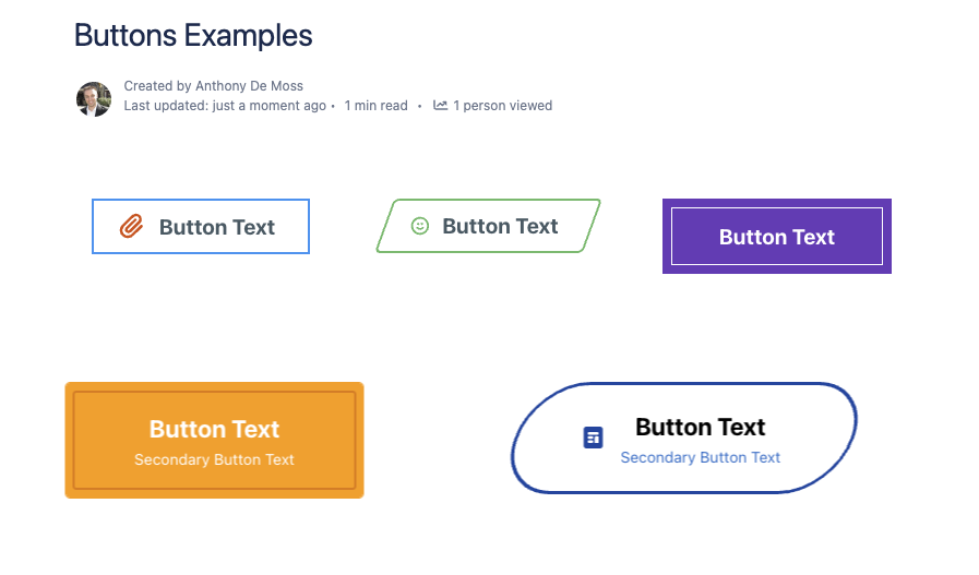
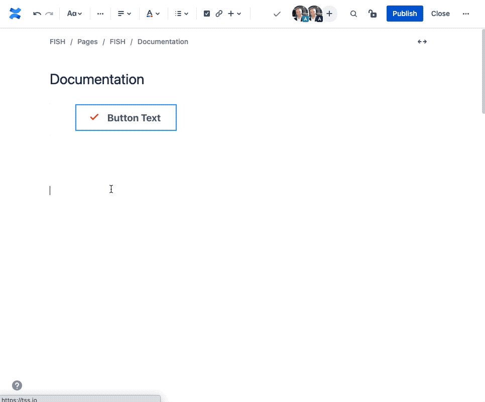
Example Buttons
Here you can see just a few examples of the different ways you can configure a button.
How to Insert or Edit the macro
To add the Simple Button macro to a Confluence page:
Use the macro insert menu "+" from editor toolbar, and select the Simple Button.
Alternatively, type '/' in the editor to trigger the macro insert suggestions and type 'Simple Button'.
Configuring the Macro
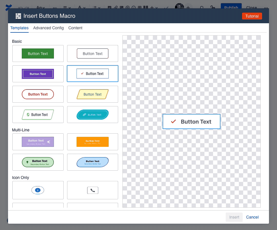
Once the macro is inserted, it will automatically trigger the configuration dialog, allowing you to customize the button.
The first screen you'll see in the Configuring dialog is the Template screen, where you'll find a collection of pre-made templates. These should give you a quick starting point for various different visuals. Selecting one of the templates will apply the settings for that template, with the results visible in the preview area in the middle.
To customize the content of the button, like text and icon, navigate to the Content tab.
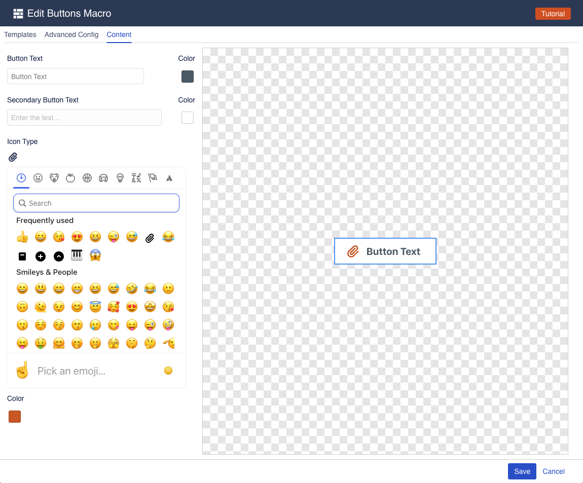
The content tab gives you easy access to the things you want to edit the most: the button text and icon. You can enter new text, change the color of the button text, as well as pick an icon and its color.
Note: not all icons support colors
The icon picker has a wide array of icons to choose from, but only the "Atlassian icons" in the last tab of the icon picker support picking a color. The remaining icons are exactly as they are, and selecting a color won't change them.
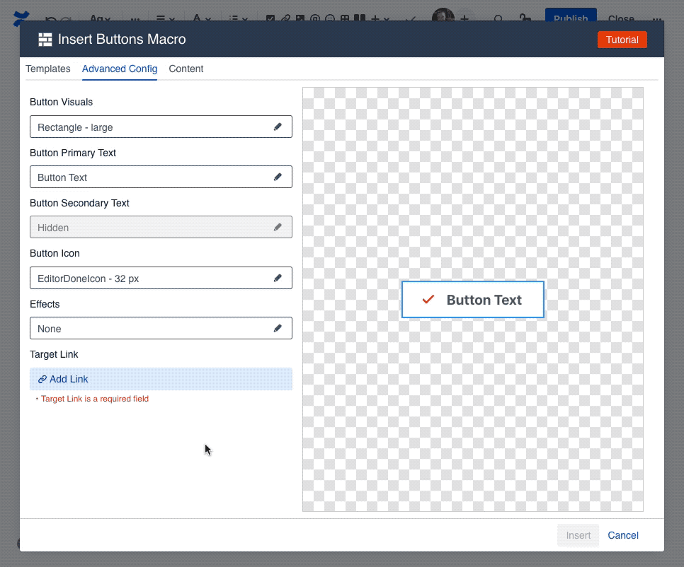
If you want to further customize your button, navigate to the "Advanced Config" tab, where you can change virtually everything about the button.
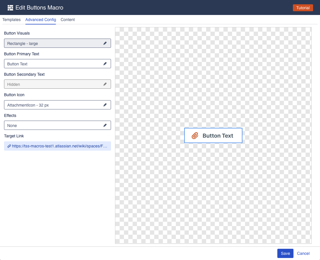
The advanced config is split into multiple groups, each of which has its own settings drawer. Click one of the fields to open a drawer and change the relevant settings.
Button Visuals
The button visuals drawer allows you to change the visual settings of the button.
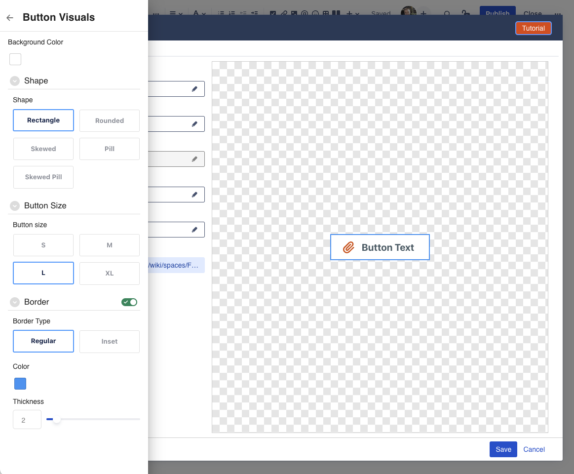
Most of the settings are pretty self-explanatory.
Background Color: allows you to change the background color of the button
Shape: changes the shape of the button from rectangle to pill to rounded corners, etc.
Button Size: changes the size of the button. Note that only XL buttons support a second line of text.
Border: Allows changing the border color, style, and thickness. Note that you can also disable the border by clicking on the toggle icon.
Button Primary Text
The button Primary Text drawer allows you to change the main text of the button.
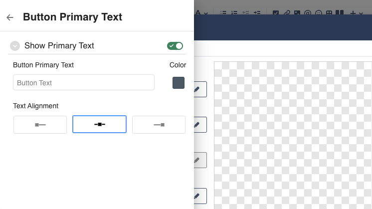
Primary Text: allows setting the actual button text.
You can only enter a single line of text. Buttons do not support line breaks. To create a multi-line button, use an XL button and set the Secondary Button Text. You can also disable the primary text, in which case you would end up with a button that is only an icon.Color: allows changing the color of the text
Alignment: allows you to change whether text is left, center, or right aligned.
Button Secondary Text
The button Secondary Text drawer allows you to change the second line of text for the button.
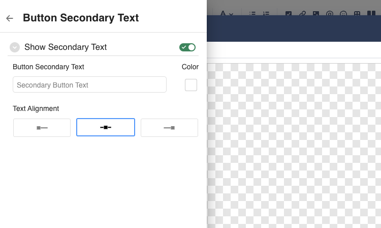
The settings here are the same as the Primary Text abovee.
Note: secondary requires a XL button
The secondary text option requires a button size of XL, as those are the only buttons to accommodate the second row of text. For all other button sizes, the second row of text will be disabled.
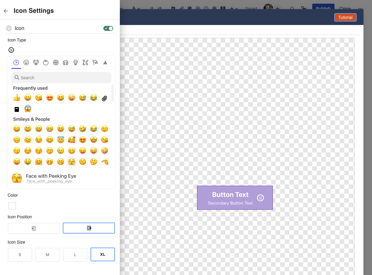
Button Icon
The button Icon drawer allows you to change the icon used for the button.
You can enable/disable the icon using the toggle switch.
Icon Type: select which icon you want to use. You can navigate between different icon sets, or use the search function to find icons.
Color: pick the color you want for your icon.
Note: only the "Atlassian icons" in the last tab of the icon picker support picking a color.
The remaining icons are exactly as they are, and selecting a color won't change them.Icon Position: change whether the icon shows to the left or the right of the button text
Icon Size: change the size of the icon to suit your needs.
Effects
The Effects drawer allow you to apply mouse-over effects to the button.
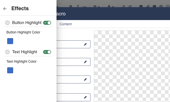
Button Highlight: enable this to add a highlight effect around the button itself. This will be visible when hovering the mouse over the button.
Text Highlight: enable this to add a highlight effect to the text of the button. This will be visible when hovering the mouse over the button.
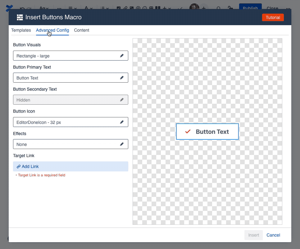
Target Link
The Target Link drawer allows you to pick the target that should be opened whenever the button is clicked.
The target link can be any url on the internet. Simply enter it into the link field and click apply.
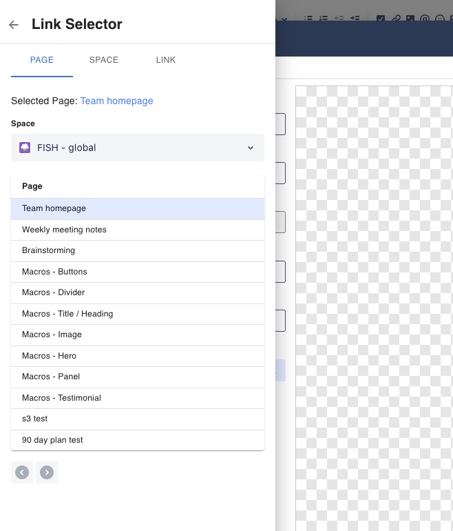
Alternatively, you can select an existing Confluence Page from the page tab, or a Confluence Space from the space tab.
How to Edit or resize the macro
To edit a button in a page, click on the button macro, and then click on the edit (pencil) icon.
This will launch the Configuration dialog, with the "Advanced Config" tab active.
Question: can I resize a button?
Third party macros do not get the same level of integration into the editor as regular Confluence Macros. This means, we can't provide you with an easy resize button like other Confluence macros.
You can still resize a button however, by editing the button, and selecting a different size in the Button Visuals Drawer
Compatibility with other Macros
The Simple Button macro is compatible with most built-in Confluence macros that allow you to place other content inside of it.
This means, you can put a button into a Columns/Layout macro, or a standard Panel, or bulleted list, etc.