Divider
Introduction
Dividers allow you to give Confluence pages more structure, and help separate content on the page, to make the page layout clearer, and content more readable for users.
Although Confluence already comes with a divider, it is a simple horizontal line that lacks any customizations.
The Simple Divider Macro on the other hand can be oriented either horizontally or vertically, and customized with a variety of different colors, line styles, and icons.
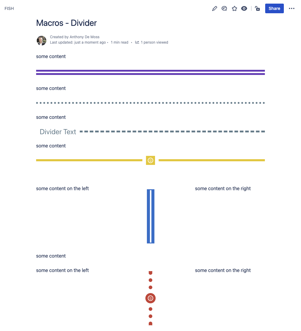
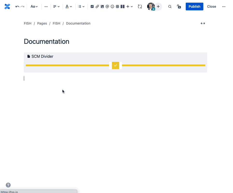
Example Dividers
Here you can see just a few examples of the different ways you can configure a divider.
How to Insert or Edit the macro
To add the Simple Divider macro to a Confluence page:
Use the macro insert menu "+" from editor toolbar, and select the Simple Divider.
Alternatively, type '/' in the editor to trigger the macro insert suggestions and type 'Simple Divider'.
Configuring the Macro
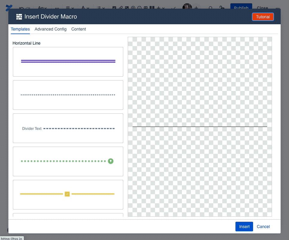
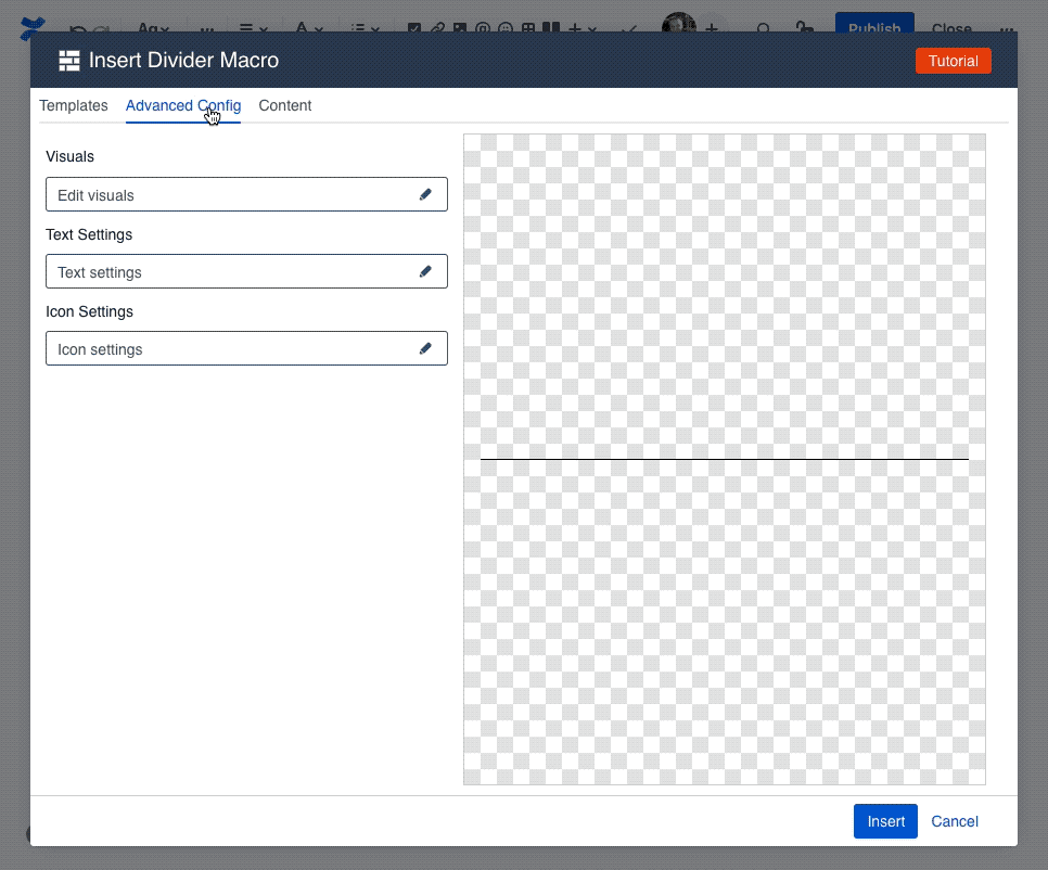
Once the macro is inserted, it will automatically trigger the configuration dialog, allowing you to customize the image.
The first screen you'll see in the Configuring dialog is the Template screen, where you'll find a collection of pre-made templates. These should give you a quick starting point for various different visuals. Selecting one of the templates will apply the settings for that template, with the results visible in the preview area in the middle.
To customize the content of the divider, like divider text, the line color, or the icon, navigate to the Content tab.
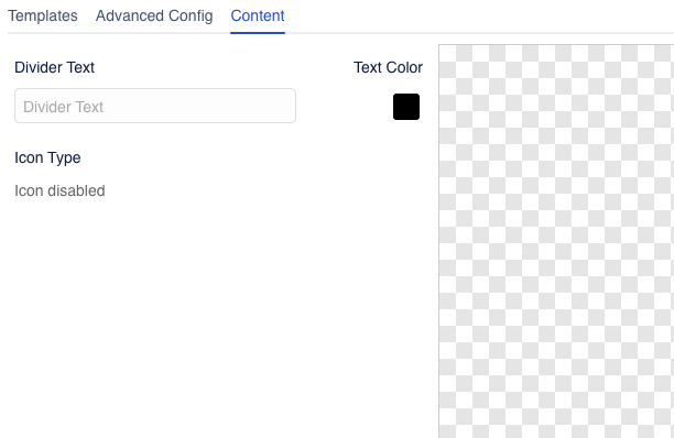
The content tab gives you easy access to the things you want to edit the most. You can enter new divider text, change the color of the text, as well as pick an icon and different line color.
Note: not all icons support colors
The icon picker has a wide array of icons to choose from, but only the "Atlassian icons" in the last tab of the icon picker support picking a color. The remaining icons are exactly as they are, and selecting a color won't change them.
If you want to further customize your divider, navigate to the "Advanced Config" tab, where you can change virtually everything about the divider.
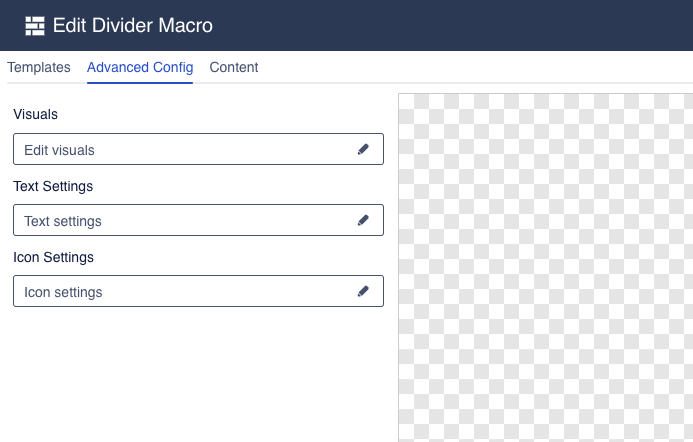
The advanced config is split into multiple groups, each of which has its own settings drawer. Click one of the fields to open a drawer and change the relevant settings.
Divider Visuals
The divider visuals drawer allows you to change the visual settings of the divider line.
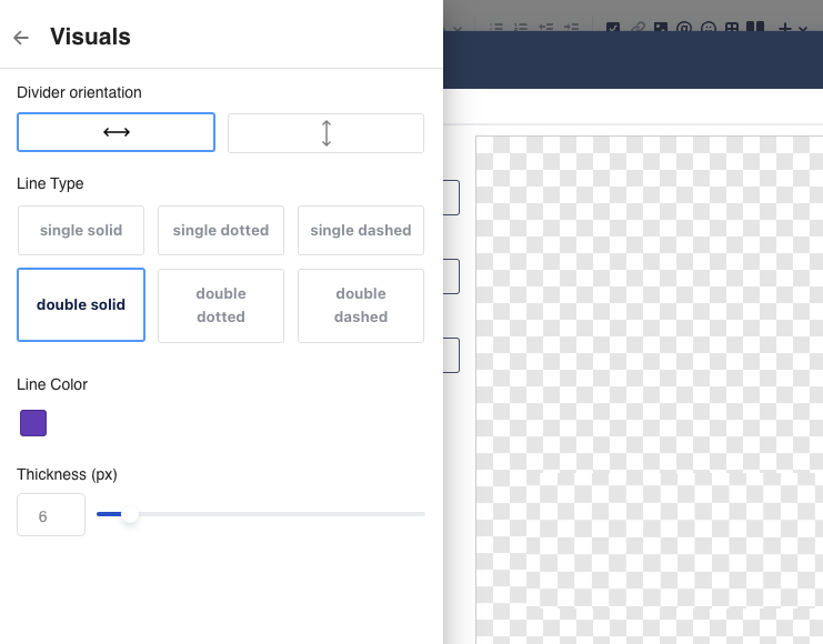
Divider Orientation: allows you to change the orientation of the divider from a horizonal line to a vertical line
Content Alignment: changes the alignment of the content (text and/or icon)
Line Type: changes the visuals of the divider line
Line Color: allows you to change the color of the divider line
Thickness: changes the thickness of the divider line.
Divider Text
The Divider Text drawer allows you to change the text shown as part of the divider.
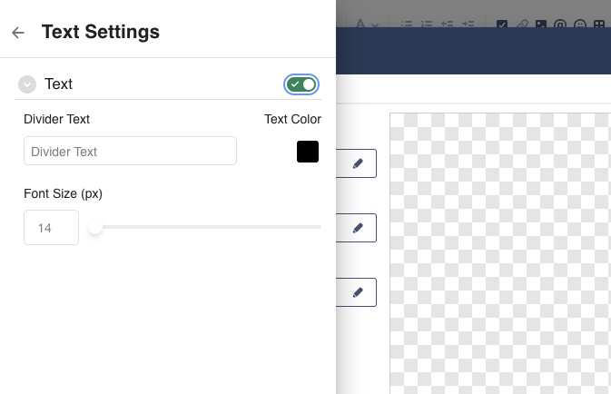
The divider text is optional. You can enable/disable the text using the toggle switch.
Divider Text: allows setting the actual text in the divider.
Note: You can only enter a single line of text. Dividers do not support line breaks.Color: allows changing the color of the text
Font Size: change the size of the divider text
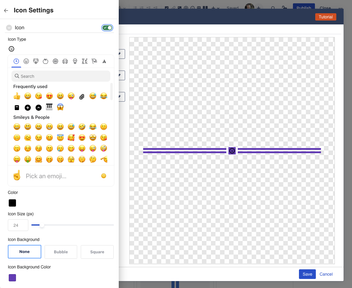
Divider Icon
The Divider Icon drawer allows you to change the icon used for the divider.
You can enable/disable the icon using the toggle switch.
Icon Type: select which icon you want to use. You can navigate between different icon sets, or use the search function to find icons.
Color: pick the color you want for your icon.
Note: only the "Atlassian icons" in the last tab of the icon picker support picking a color.
The remaining icons are exactly as they are, and selecting a color won't change them.Icon Size: change the size of the icon to suit your needs.
Icon Background: change whether the icon should have a background or not.
The background can be shaped like a square, or a bubble around the icon, and will use the same color as the divider line itself.
How to Edit or resize the macro
To edit a divider in a page, click on the divider macro, and then click on the edit (pencil) icon.
This will launch the Configuration dialog, with the "Advanced Config" tab active.
Question: can I resize a divider?
The divider is a "block" macro, similar to the Confluence Divider, or Panel macro.
You can change the width of the divider between "center", "wide", and "full width".
Compatibility with other Macros
The Simple Divider macro is compatible with most built-in Confluence macros that allow you to place other content inside of it.
This means, you can put a divider into a Columns/Layout macro, or a standard Panel, a table, and so forth.