Hero
Introduction
A hero section is a large content block, consisting of a background image, some text and sometimes a call to action. It is also the first thing a users see on a page, thus making it perfect to convey any important information you want a user know, right from the start.
The Simple Hero macros allows you to create such a Hero section, and customize it with a background color, or a background image of your choice, along with title and subtitle, and a primary and secondary action button. As an added bonus, the macro integrates with Unsplash, giving you access to over 3 million free high-resolution images you can easily select as a background image.
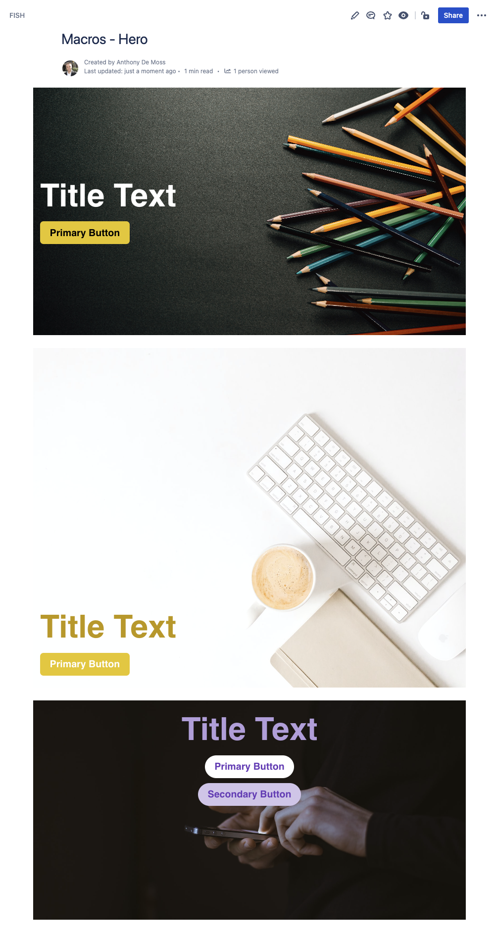
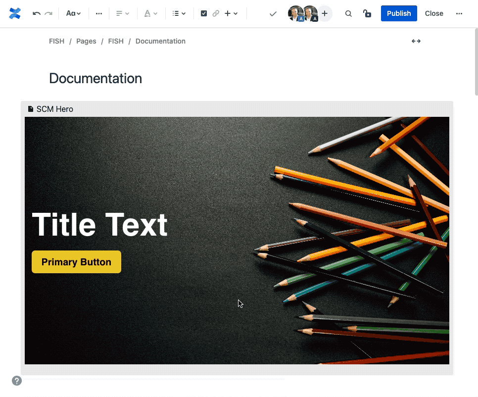
Example Hero Sections
Here you can see just a few examples of the different ways you can configure a hero section.
How to Insert or Edit the macro
To add the Simple Hero macro to a Confluence page:
Use the macro insert menu "+" from editor toolbar, and select the Simple Hero.
Alternatively, type '/' in the editor to trigger the macro insert suggestions and type 'Simple Hero'.
Configuring the Macro
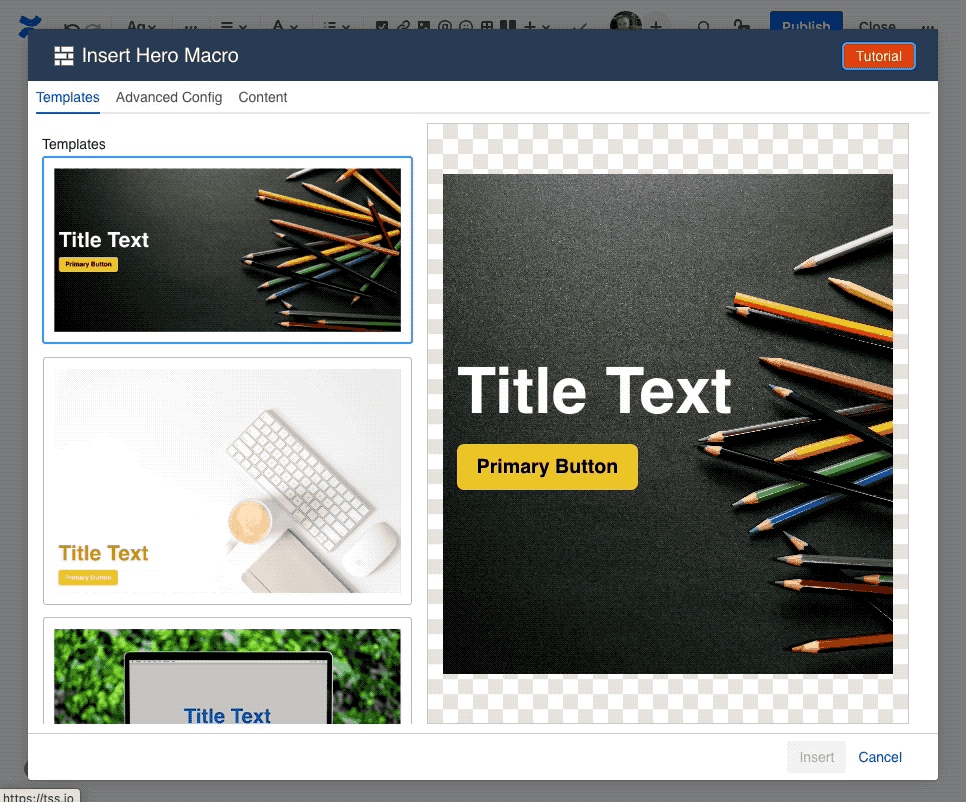
Once the macro is inserted, it will automatically trigger the configuration dialog, allowing you to customize the hero section.
The first screen you'll see in the Configuring dialog is the Template screen, where you'll find a collection of pre-made templates. These should give you a quick starting point for various different visuals. Selecting one of the templates will apply the settings for that template, with the results visible in the preview area in the middle.
To customize the content of the Hero section, like text or action buttons, navigate to the Content tab.
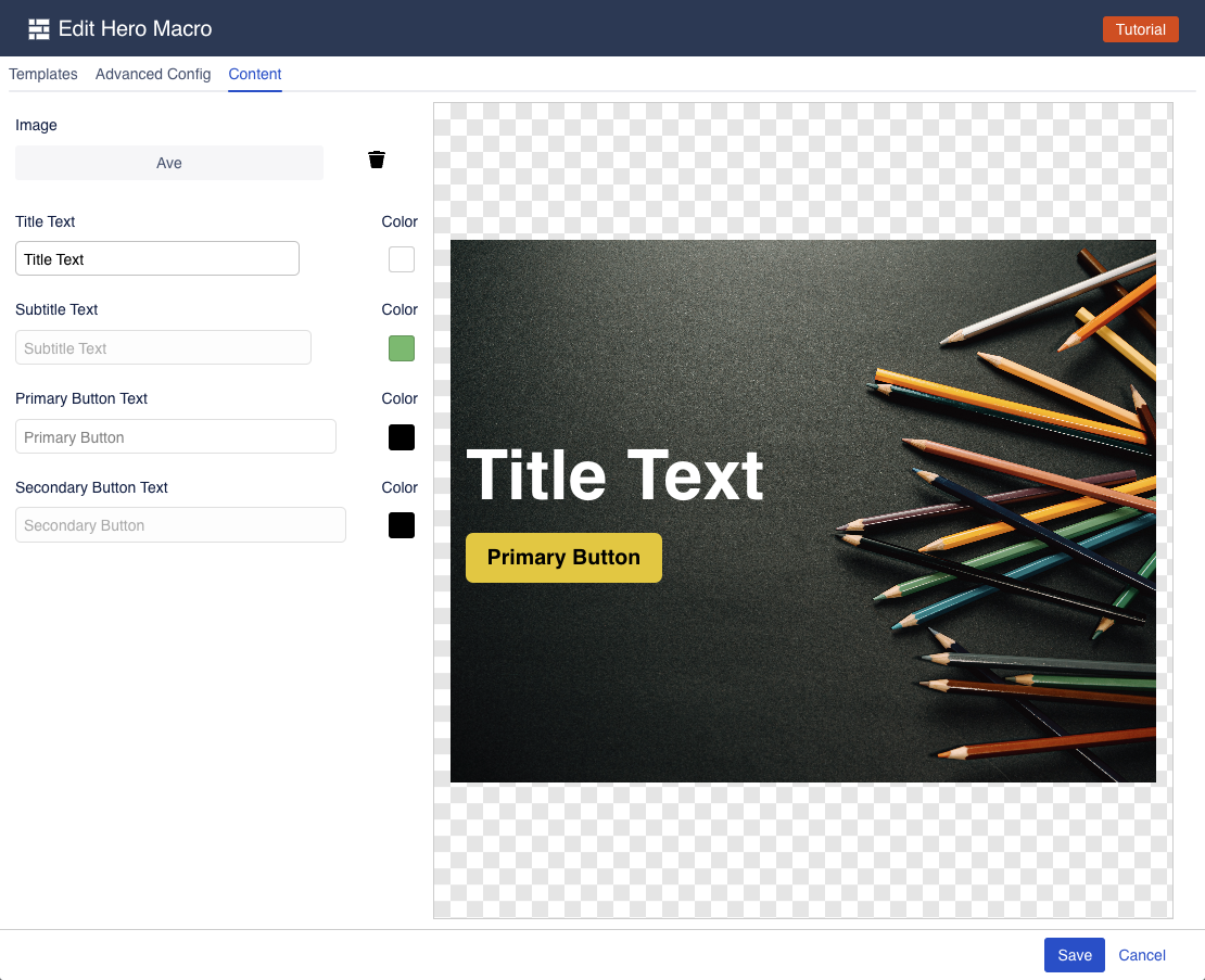
The content tab gives you easy access to the things you want to edit the most: the hero text and button text.
If you want to further customize your Hero section, navigate to the "Advanced Config" tab, where you can change all the available settings.
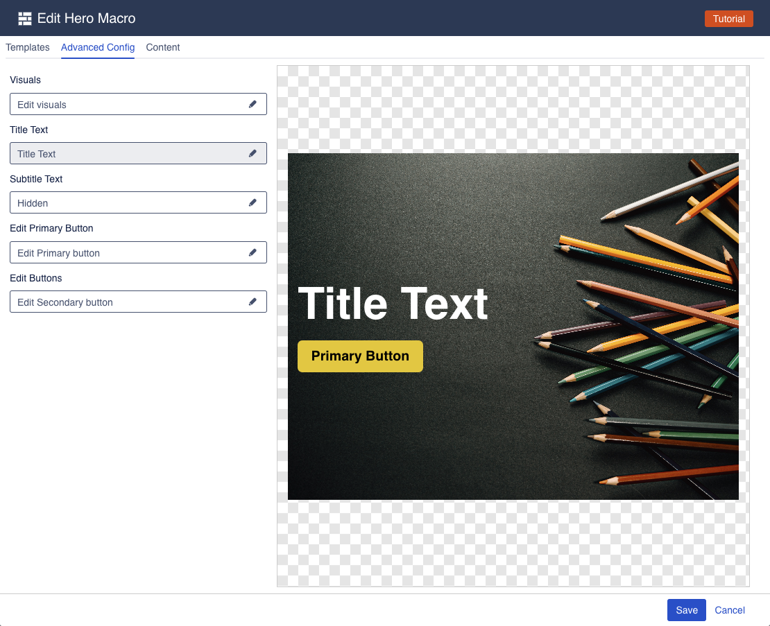
The advanced config is split into multiple groups, each of which has its own settings drawer. Click one of the fields to open a drawer and change the relevant settings.
Hero Visuals
The hero visuals drawer allows you to change the visual settings of the Hero Section.
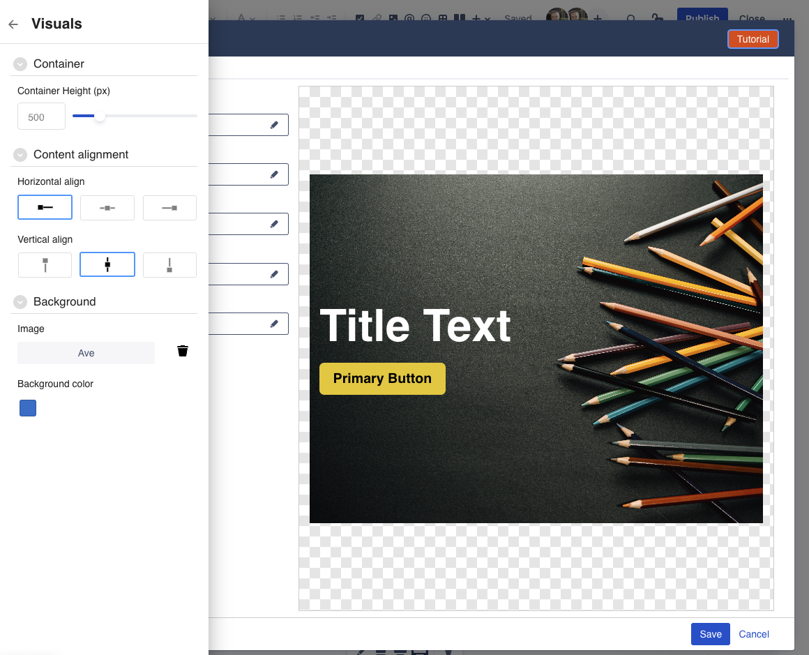
Most of the settings are pretty self-explanatory.
Container Height: this allows you to change the height of the Hero section. Note that the width is automatically the full width of the page.
Background Color: You can set the background color of the hero section. Note that this only applies if there is no background image.
Content Alignment: Decide whether the content of your Hero section (the title, subtitle, and buttons), should be aligned left, center, or right side, as well as whether they should be vertically aligned towards the top, bottom, or middle.
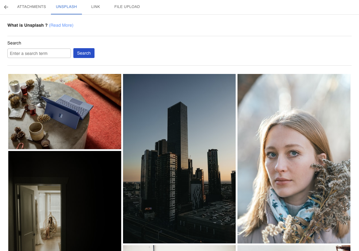
Background Image: Instead of a simple colored background, your Hero section can also have a background image. Use the Image Picker drawer (see details below) to select an Image attached to any page or space, or use an image from Unsplash.
Image Picker
The Image picker drawer allows you to select a background image to be used.
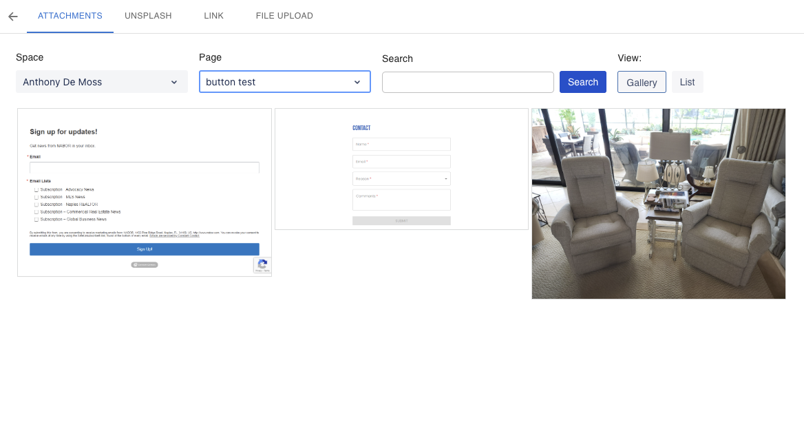
The image picker allows selecting an image from any space, as well as any page within any space.
Alternatively, you can use the Unsplash tab to select one of over 3 million free high-resolution images.
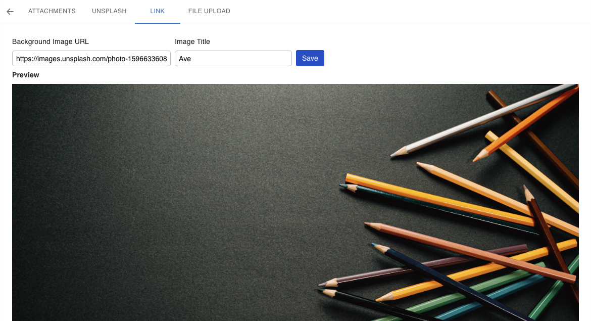
If you want to use an image hosted elsewhere, you can also paste the url directly into the image url field within the Link tab.
Title Text
The Title Text drawer allows you to change the main text (the first line) of the Hero section.
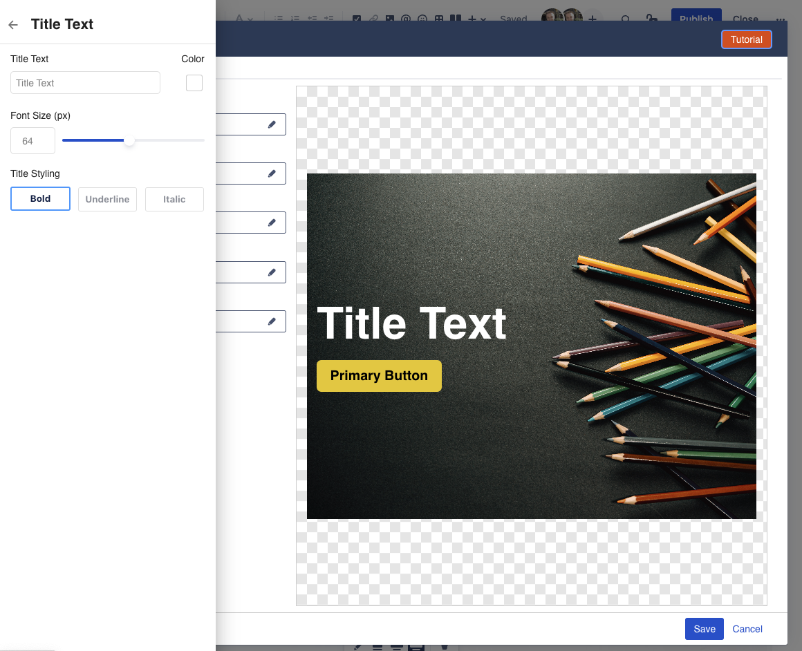
Title Text: allows setting the actual heading text.
You can only enter a single line of text. Use the Subtitle Text to add a second line of text.Color: allows changing the color of the text
Text Size: change the size of the heading text
Subtitle Text
The Subtitle Text drawer allows you to change the second line of text (subtitle).
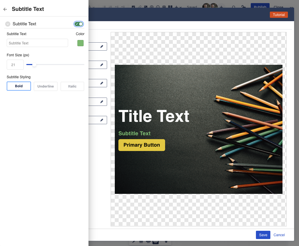
The settings here are the same as the Title Text above.
Note that the subtitle text is optional, and can be enabled/disabled by using the toggle switch.
Primary Button and Secondary Button
The Primary and Secondary button drawers allows you to add action buttons to your Hero section.
Note that the buttons are optional, and can be enabled/disabled by using the toggle switch in each drawer.
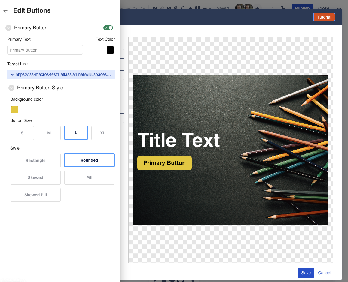
Button Text: allows setting the actual button text.
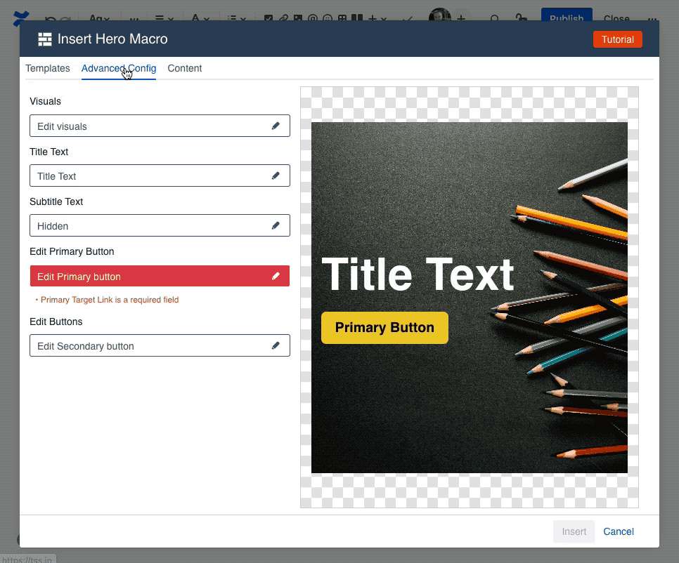
Note that you can only enter a single line of text.Target Link: buttons are clickable actions, and as such must point somewhere. Here you can set the target link that the button points to. This opens the Target Link Drawer (see details below).
Text Color: allows changing the color of the button text.
Background Color: allows changing the background color of the button.
Button Size: allows changing the size of the button from small, to medium, to large, or extra large.
Button Style: changes the visual style of the button between a rectangle, a rectangle with rounded corners, a pill, a skewed rectangle, or a skewed pill.
Target Link
The Target Link drawer allows you to pick the target that should be opened whenever the button is clicked.
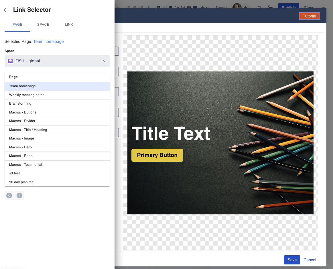
The target link can be any url on the internet. Simply enter it into the link field and click apply.
Alternatively, you can select an existing Confluence Page from the page tab, or a Confluence Space from the space tab.
How to Edit or resize the macro
To edit a Hero section in a page, click on the hero macro, and then click on the edit (pencil) icon.
This will launch the Configuration dialog, with the "Advanced Config" tab active.
From there, you can change the configuration using the options to see above.