Panel
Introduction
Panels allow you to display your content in a more organized way, visually highlighting the information the panel contains.
The Simple Panel Macros serves as a more elaborate alternative to the built-in Confluence panel macro. It allows for a variety of configuration options that allow for a separate header and footer, as well as options for different types of borders, colors, icons, and generally more options for styling.
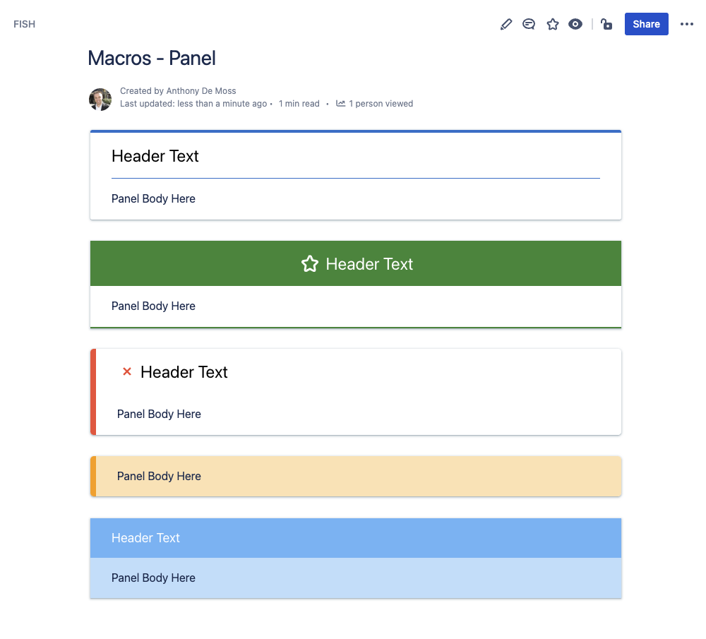
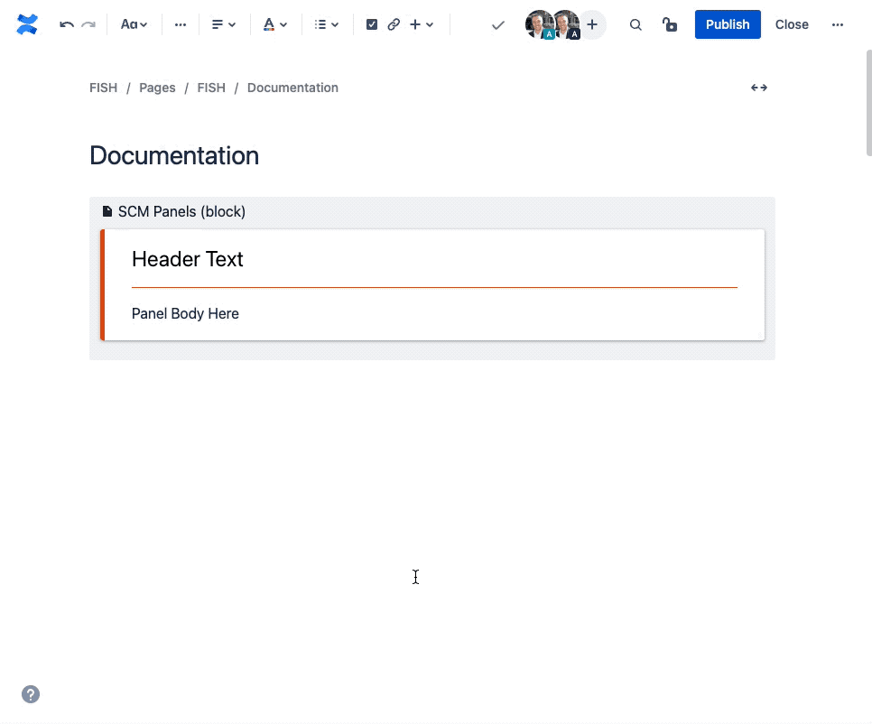
Example Panels
Here you can see just a few examples of the different ways you can configure a panel.
How to Insert or Edit the macro
To add the Simple Panel macro to a Confluence page:
Use the macro insert menu "+" from editor toolbar, and select the Simple Pane;.
Alternatively, type '/' in the editor to trigger the macro insert suggestions and type 'Simple Panel'.
Configuring the Macro
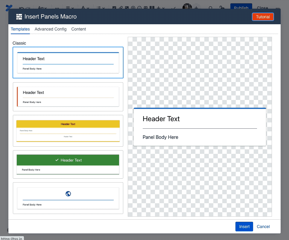
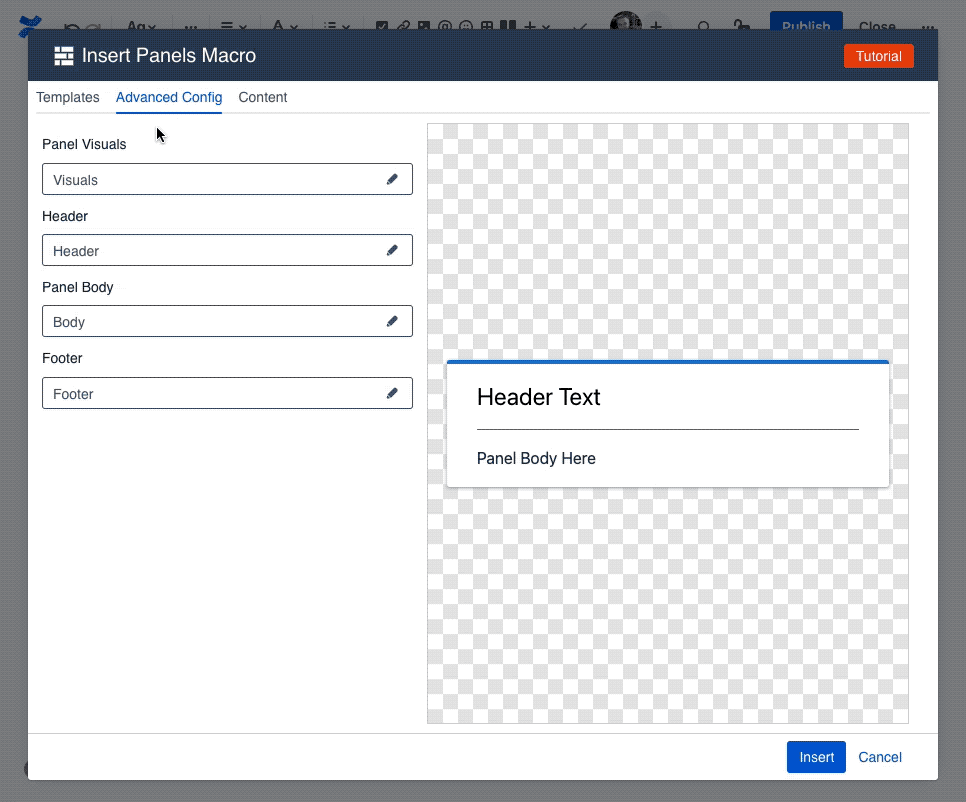
Once the macro is inserted, it will automatically trigger the configuration dialog, allowing you to customize the panel.
The first screen you'll see in the Configuring dialog is the Template screen, where you'll find a collection of pre-made templates. These should give you a quick starting point for various different visuals. Selecting one of the templates will apply the settings for that template, with the results visible in the preview area in the middle.
To customize the content of the Panel, like panel body text, header text, header icon, or footer text, navigate to the Content tab.
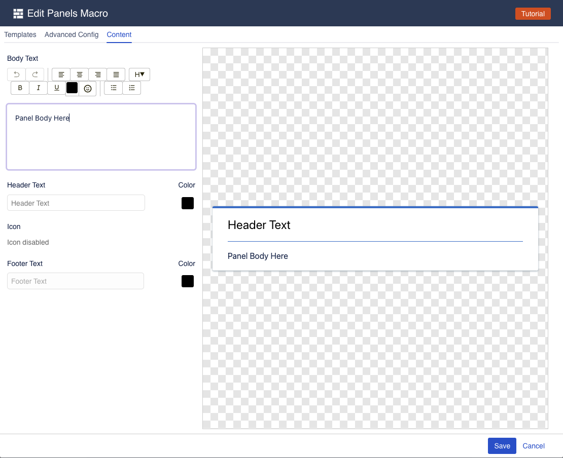
The content tab gives you easy access to the things you want to edit the most: the panel body and header text. Here you can quickly enter new text, as well as pick a new icon and its color.
If you want to further customize your Panel, navigate to the "Advanced Config" tab, where you can change virtually everything about the Panel.
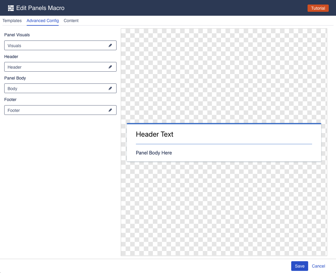
The advanced config is split into multiple groups, each of which has its own settings drawer. Click one of the fields to open a drawer and change the relevant settings.
Panel Visuals
The button visuals drawer allows you to change the visual settings of the button.
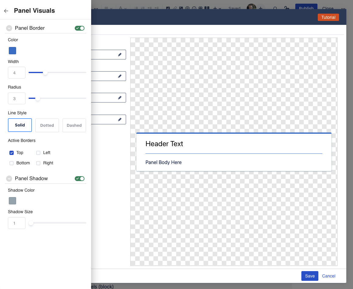
Panel Border Panel borders are optional, and can be enabled/disabled using the toggle switch.
Active Borders: here you can set which side of the panel should show a border. We intentionally split out each side as a separate setting to provide additional flexibility when styling your panel.
Color: Set the color for the border.
Width: How thick the border is.
Radius: Whether the border should be squared, or have rounded corners. Increasing the radius makes the corners more rounded.
Line Style: How the borders should be drawn. As a solid line, or as a dashed or dotted line.
Panel Shadow: Panel Shadow is optional, and can be enabled/disabled using the toggle switch.
When enabled, a drop shadow is added to the panel, to give it a bit more visual depth.Shadow Color: set the color of the dropshadow
Shadow Size: change how big the shadow is
Panel Header
The Panel Header drawer allows you to change the visual settings of the panel header.
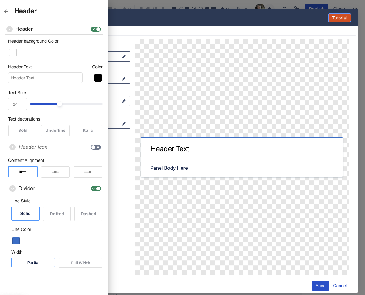
The panel header is optional, and can be enabled/disabled using the toggle switch. When disabled, the panel will render just the body. When enbled, the panel will render a separate header, where you can add a title, as well as an icon.
Header Background Color: background color for the header. Note: this applies to the header only, and not the rest of the panel.
Header Text: the actual text you want to display in the header
Text Color: change the color of the header text
Text Size: change the size of the header text
Text decorations: make the header text bold, underlined, or italics.
Header Icon: The header icon is optional and can be enabled/disabled using the toggle switch. It allows showing an icon next to the header text. Note: if you want just an icon in the header, simply leave the header text empty
Icon: the actual icon you want to show in the header
Color: the color for the icon
Size: size for the icon
Icon Alignment: whether the icon should be shown to the left or right of the text.
Note: this setting is independent of the content alignment.Divider: The divider is optional and can be enabled/disabled using the toggle switch. It allows showing a dividing line between the header content and the panel body to create visual separation.
Line Style: whether the divider is a solid line, dotted line, or dashed line
Line Color: the color for the divider
Line Width: whether the divider line is full width (goes from edge to edge) or is partial (looks like a floating line)
Content Alignment: whether the contents of the header (text and icon) should be aligned left, middle, or right.
Note: not all icons support colors
The icon picker has a wide array of icons to choose from, but only the "Atlassian icons" in the last tab of the icon picker support picking a color. The remaining icons are exactly as they are, and selecting a color won't change them.
Panel Body
The Panel Body drawer allows you to change the main text (body) of the panel, and change the spacing around the body.
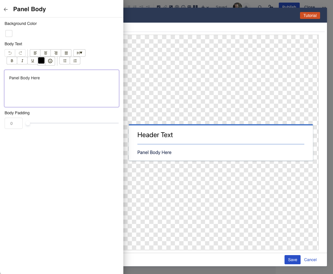
Background Color: Give the panel body a different background color.
Body Text: The actual text you want in the body. This uses a simple rich text editor that allows for basic formatting (bold, underline, italics), icons, bullet and number lists, as well as h1, h2, etc headings.
Body Padding: adding some padding around the body, to change how much spacing is to the left, right, top, and bottom of the text. Increasing this adds extra space, so content in the panel doesn't run up againt the edges of the panel.
Question: Can I embed other macros in the panel?
Not at this point. We're intentionally trying to keep the panel simple, by only allowing certain styling and content. At some point in the future, we'll most likely add a second Panel Macro that works differently and allows embedding other macros inside the panel.
Panel Footer
The Panel Footer drawer allows you to change the visual settings of the panel footer.
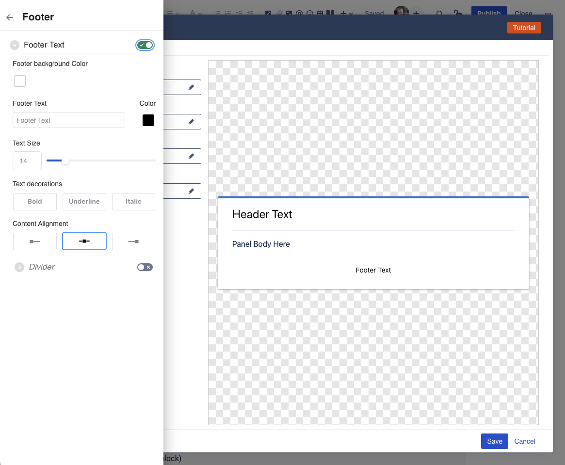
The panel footer is optional, and can be enabled/disabled using the toggle switch. When enbled, the panel will render a separate footer area below the panel body, where you can add additional text that is visually separate from the panel body.
Footer Background Color: background color for the footer. Note: this applies to the footer only, and not the rest of the panel.
Footer Text: the actual text you want to display in the footer
Text Color: change the color of the header text
Text Size: change the size of the header text
Text decorations: make the header text bold, underlined, or italics.
Content Alignment: whether the contents of the footer should be aligned left, middle, or right.
Divider: The divider is optional and can be enabled/disabled using the toggle switch.
It allows showing a dividing line between the panel body and the panel footer to create a visual separation.Line Style: whether the divider is a solid line, dotted line, or dashed line
Line Color: the color for the divider
Line Width: whether the divider line is full width (goes from edge to edge) or is partial (looks like a floating line)
How to Edit or resize the macro
To edit a Panel in a page, click on the panel macro, and then click on the edit (pencil) icon.
This will launch the Configuration dialog, with the "Advanced Config" tab active.
Question: can I resize a panel?
The divider is a "block" macro, similar to the Confluence Divider, or Panel macro.
You can change the width of the divider between "center", "wide", and "full width".
Compatibility with other Macros
The Simple Panel macro is compatible with most built-in Confluence macros that allow you to place other block-level elements inside of it.
This means, you can put a Panel into a Columns/Layout macro, or a table.